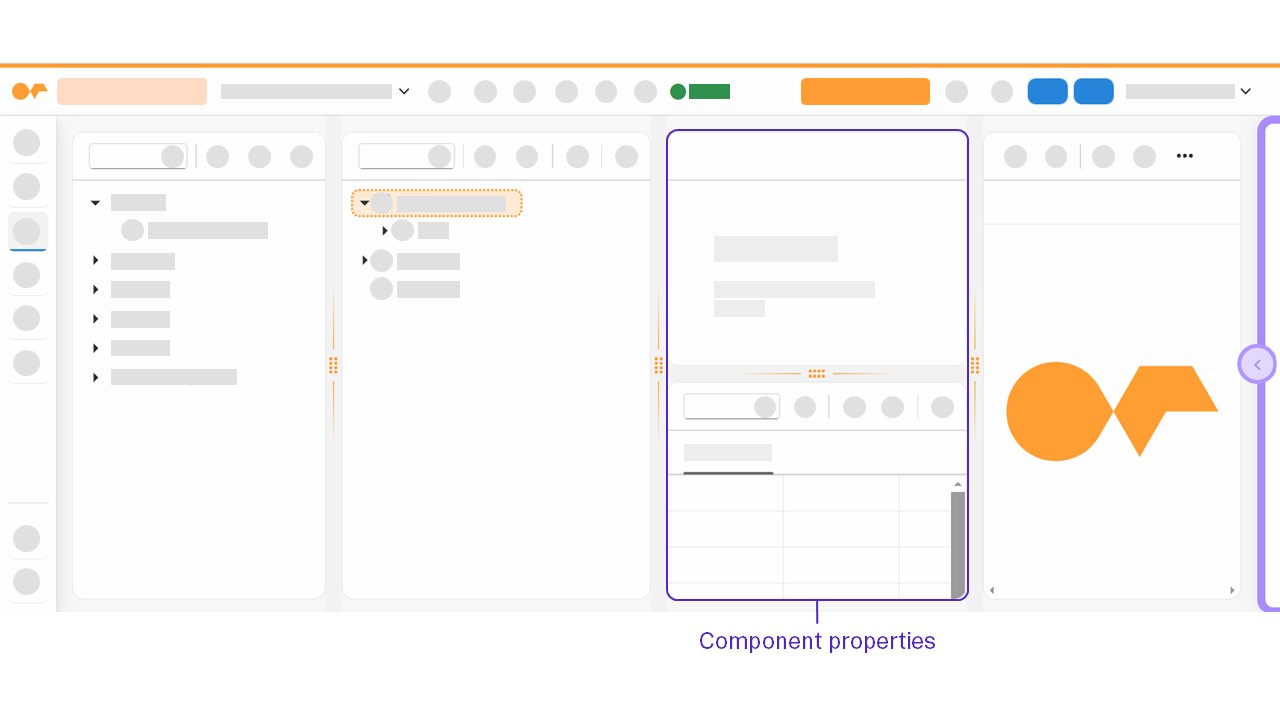
Component properties
The component pane consists of two stacked panes: the UI object pane and the properties pane.

In the App Designer object properties, you can edit components you have selected in the application tree. The UI object pane shows basic properties, such as name, description or paths to connected resources.
In the properties pane, you define the component in detail. All supported component properties according to your corresponding UI5 version are displayed dynamically in the properties pane. Select from predefined values, enter new values, bind data from resources, or add scripts to events.
To show or hide disabled objects that exist for your application when binding data from resources, for example, when binding APIs to a component, select or deselect Show disabled objects. Disabled objects contain a highlighted red bar to differentiate from enabled objects for property fields.
Fields of properties of components that deviate from default settings in the properties pane are highlighted for visual recognition.
When selecting values, default values contain a highlighted bar to differentiate from other possible values for property fields.
You can access relevant information and documentation about the component by selecting the icon next to its title.
Component settings
The setting will give you the following options to enable or disable:
- Enable properties mini apps
-
This feature allows certain properties of a component to be displayed in a more user-friendly format for improved readability.
- Show deprecated properties
-
You can change the UI5 version of your application in the Properties tab of the side navigation option Settings in the App Designer. Consequently, certain components may lack support for specific attributes or properties. Deprecated attributes and properties are hidden from display by default. If you select Show deprecated properties, these deprecated attributes and properties are displayed and highlighted for visual recognition in the component properties pane.
Attribute actions
Use attribute actions to modify your application according to attribute types.
- (Show Binding)
-
For attributes of type Properties, select (Show Binding) to bind a binding property to a property attribute.
- (Show Script)
-
For attributes of type Events and Formatter, select (Show Script) for the event script or formatter script, choose between JavaScript and TypeScript to set the format type, and to open the preview pane of the corresponding component element. The event or formatter is automatically added within a generated
EventsorFormatterfolder in the application tree.
Property option menu
By right-clicking the edited values of a property in the properties pane, you open a menu with the following options:
- Convert to TypeScript/Convert to JavaScript
-
For component properties of type Event, you can convert individual properties from JavaScript to TypeScript or vice versa, depending on your use case.
- Reset
-
You can reset component properties of type Attributes, Properties, Formatter, or Events to their default values.