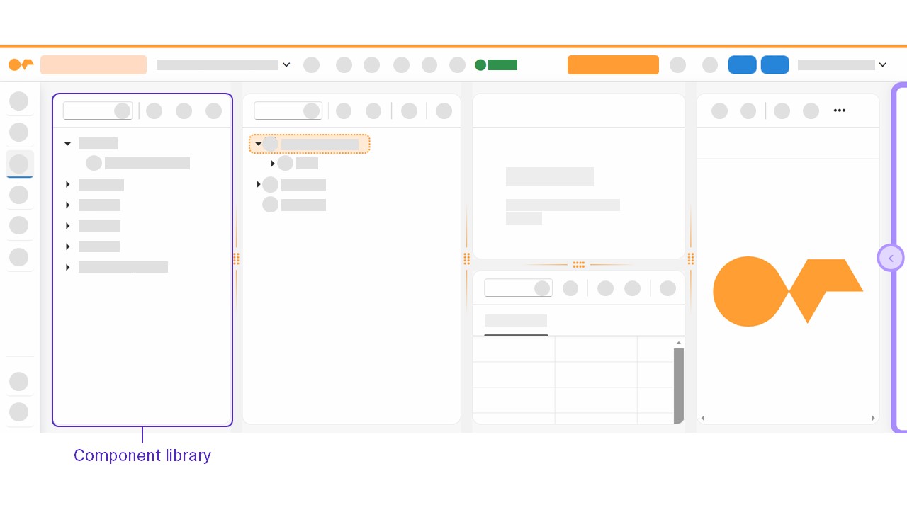
Component library
The component library is a pane that offers data sources that you can use as components to create your application. Drag and drop the components you want to use in your application to the application tree.

In the App Designer, you can use components from the following categories:
- Favorites
-
Components from the remaining categories in the component library can be selected as favorites via drag and drop or through the component option menu for fast reuse.
- Resources
-
Components to integrate data from outside the App Designer, such as JavaScript files or REST APIs, to your application.
- Highcharts
-
Components to create graphs and plots.
- Bootstrap
-
Neptune UI components based on the Bootstrap components to design and structure your application.
- OpenUI5
-
OpenUI5 components to design and structure your application.
- Custom Components
-
List of all available custom components. Read more at Custom Component
Component option menu
By right-clicking a component in the component library, you open a menu with the following options:
-
Object Info: Opens reference documentation to the selected component in a new browser tab, for example, API reference information from the UI5 Demo Kit for an OpenUI5 component
-
Add to favorites: Adds the selected component to the Favorites section of the component library