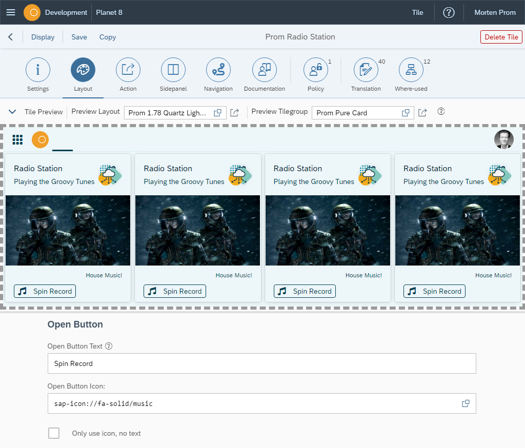
Tile Layout
In the Tile Layout section, you define the look and feel of your tiles. Add title, information, icons and images to fit your company profile.
In the Tile Layout section, you define the look and feel of your tiles. Add title, information, icons and images to fit your company profile.
Preview
The look and feel of a tile is dependent on the environment it is running in. The layout has some settings that can affect the tile. The tile group where the tile is added, is also responsible for a few things that will affect the tile look and feel.
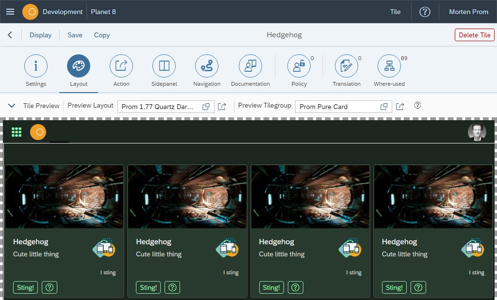
You can choose to preview til tile in a layout and tile group of your choice.
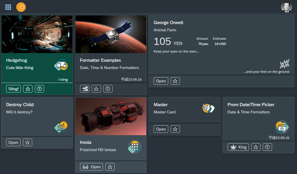
In this example a tile with medium with is previewed in a tile group with many tiles pr row. This results in 3 tiles pr row in a standard Neptune app where the app width is limited to 1280px in the Shell object. Read more about the tile width and number of tiles pr row in the documentation for tiles/ tile groups.
Tile Colors
Tiles have a background color, border color and text color. Tile action buttons have their own background color, border color and text color. You can define these colors multiple places and combine the colors in many different ways.
SAPUI5 themes are the basis for all colors in Neptune applications and in the Neptune Launchpad. You add SAPUI5 themes to Neptune layouts and add the layouts to your Neptune Desktop Launchpads and Mobile Clients. At the moment, in late 2020, we only have one pure dark theme: SAPUI5 Quartz Dark (sap_fiori_3_dark). Layouts based on the SAPUI5 Quartz Dark Theme, or a custom theme, that has the SAPUI5 Quartz Dark Theme as a base theme, will be considered dark layouts. All other layouts will be considered light layouts.
The tiles in the Neptune launchpad is based on the sap.m.Card component. You can customize the sap.m.Card colors in the SAP UI Theme Designer and add your custom theme to one of your Neptune layouts.
If you want to use tile colors not defined in an SAPUI5 theme, you can create your own in Cockpit→ Development → Color Designer.
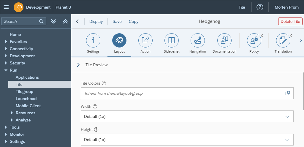
The colors defined in the Neptune Color Designer can be assigned your tiles 3 different places.
-
Layout
-
Tilegroup
-
Tile
If you assign colors defined in the Neptune Color Designer to a layout, the colors will be used for all tiles in the launchpad. If you assign the colors to a tilegroup, only tiles in that tilegroup will get those colors. If you assign the colors to a tile, only that tile will get those colors. So you can assign colors in a hierarchy, first general colors in a layout and then override these colors in tilegroups and tiles. # How to assign colors defined in the Neptune Color Designer
This example takes place in the Neptune Layout, it’s the same process in tilegroups and tiles.
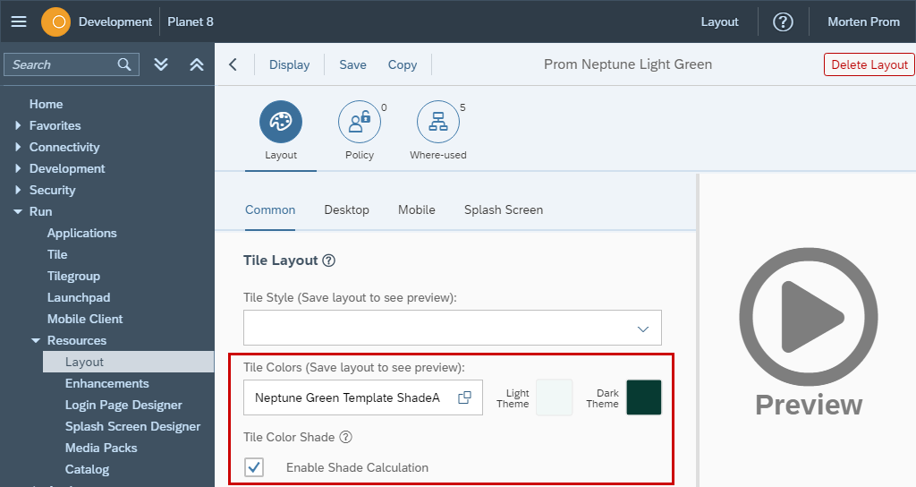
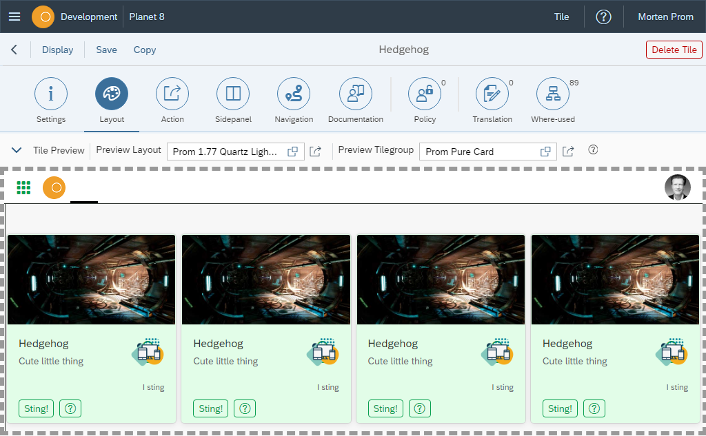
Example of color assignment in the tile configuration:
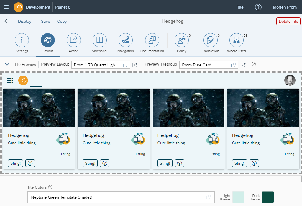
In this example a tile has been set with a green background color. The background will fit in both a dark themed layout and a light themed layout.


Tile Width & Height
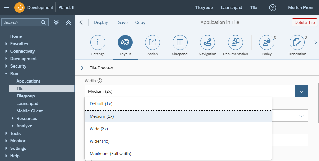
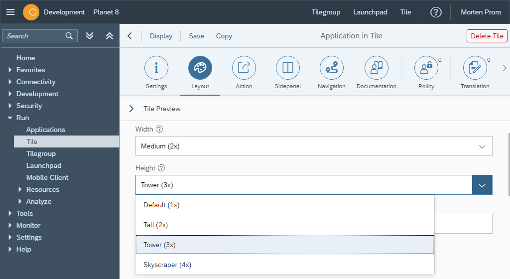
A tile will take up a certain amount of cells in the launchpad CSS grid. Default is 1 cell, but you can set how many cells the tile should occupy, both in height and width. A tile with a Fiori style has a fixed width. All other tile types are responsive, they will adapt to the width of the screen. How many tiles that are displayed, is determined by a combination of the number of tiles per row and the tile width. The number of tiles per row are maintained on the Tile Group.
Styleclass
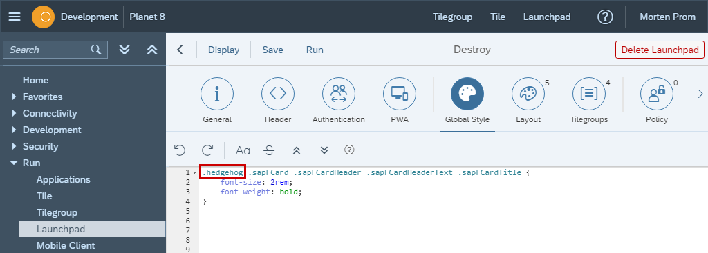
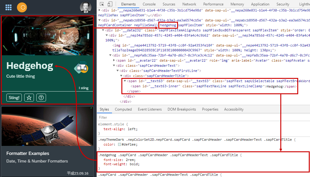
You can target Neptune Standard Launchpad content using a combination CSS classes in many different ways. Everything has its own styleclass, so that you very easy can create your own look and feel. One way to target one specific tile, is to add a styleclass to the tile in the configuration.

Target the CSS class in either the layout stylesheet section, or in the launchpad global style section. Here the tile title is made big and bold!
Hide buttons and make tile clickable
Normally the action behind the tile is performed by clicking the open button, but the buttons can be removed and the whole tile made clickable. A clickable tile can be added or removed from favorites in the user menu.

Icon & Icon Image
You can add a small descriptive icon to each tile. It can be an one of the many thousands font Icons included in Neptune, or an icon image. If icon image is set, it will be used in tiles and navigation items where applicable. When space is limited, icon font is used.
![]()
In the left sidebar, image will be used.

In the open apps menu in the Launchpad, icon will be used.

Display tile icon inline
A tile icon can be shown in its own block beneath the title/subtitle, or inline next to the title/subtitle. All dynamic tiles except the numeric type, must display the icon inline. The same goes for icons added to tiles with live applications. The advanced dynamic numeric tile, can only have block layout icon, classic dynamic numeric tiles, can have both block and inline icons.
![]()
Tile Image
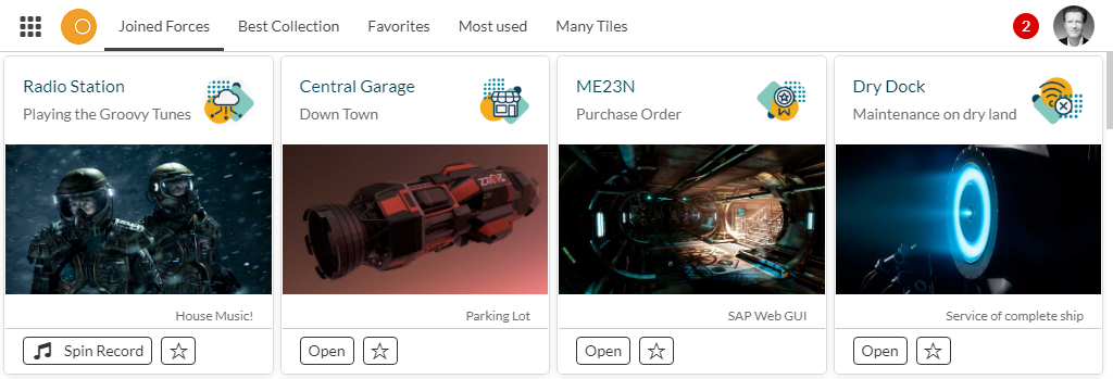
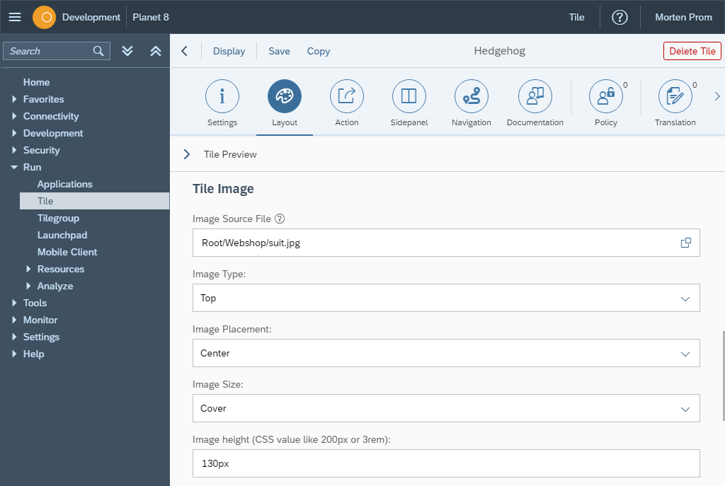
You can add a tile image to your tile. The tile image will fill more of the tile than the tile icon. The tile image can be a background image, where title, info and all other tile content is placed onto the background image. The tile image can also be placed at the top of the tile, all tile content will be placed below the image. Or the image can be placed below tile info, but above the tile footer and the tile buttons.
Tile Image placement
When a tile image has to adjust to other tiles with content that influences the tile image, the image will adjust in different ways depending on placement, size and height settings. The settings add plain CSS attributes to the images, so read up on your CSS image skills to fully take advantage of these settings.
Button Colors
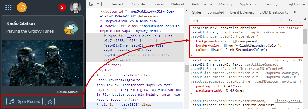
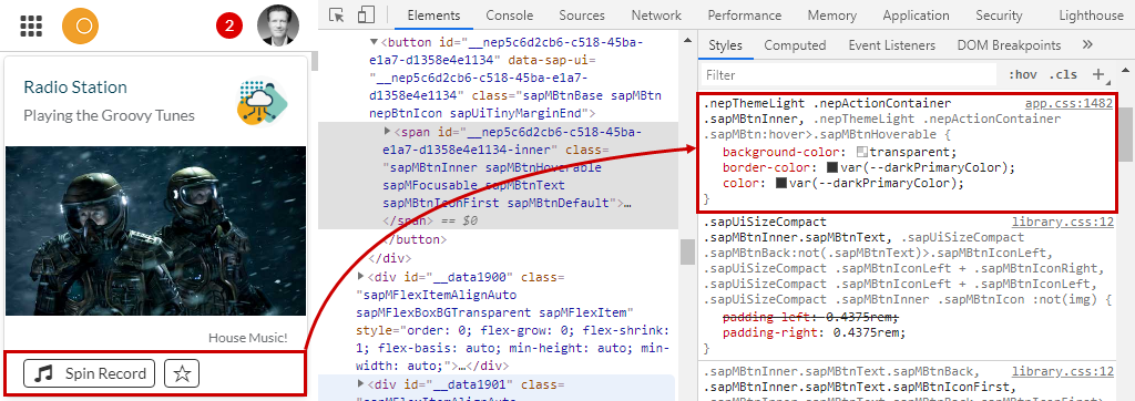
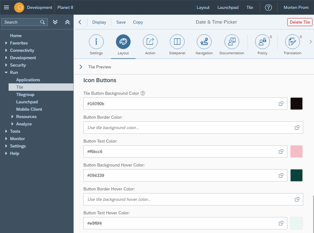
Tile action button colors will normally be defined in the SAPUI5 theme or in a color defined in the Neptune Color Designer. But you can override tile button colors if needed.
If you don’t specify anything else, you get button colors for light and dark SAPUI5 Themes directly from the Neptune Launchpad.
